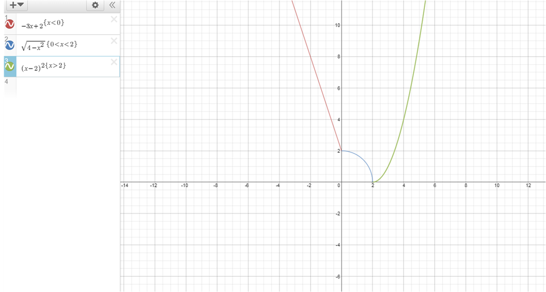
In order to find the right equation for this piecewise function, I had to play around with Desmos and try different equations until I got the right one. To get the red line, I knew that it was less than zero, so that meant x<0 had to be in the equation somewhere. The domain changed from each individual function because they didn't continue on forever, each function had a point on the graph where they stopped. For example the red line's domain would be negative infinity to zero. The blue line's domain would be zero to two and the green line would be two to infinity, therefore they are all different. The range however did not change, the range for all three of these equations will always be zero to positive infinity.
This data on this graph appears to be Exponential Growth because it is gradually increasing. The domain and range of the function is (0, infinity) because the graph will continue on forever, slowly increasing as it goes on. The graph will go on in both directions forever, however I want to limit it to (0, infinity) because negative numbers would not give you an answer that makes sense.
The article explains how sales in digital music, that were once booming are now getting lower and lower. This effects my predictions of the domain and range because the graph would not increase forever, it would start to decrease. It cannot be a continuous function because at some point some numbers won't work. They may get too big to be put in the function. For the Cress and Little problem I had to figure out if the basketball was going to make it in the hoop. I uploaded the image to Geogebra and put in a line of best fit in to decide if the ball is going to go in. I don't think that the basketball will go in the hoop because looking at the line of best fit it looks as though the ball is going to fall just in front of the hoop and not inside of it.
This video shows a skateboard going down at ramp at either 21 inches, 14 inches, or 7 inches. While I watched the skateboard in real time I had to make a prediction of what a graph of this would look like. As I watched the skateboard go down in slow motion I would mark actual points on the graphing. After that was done I was able to see how different my prediction was from the actual graph with actual numbers from the video. 1. How close was your prediction to the actual graph? If you're graphs were different then why were they different? What initial reasoning led you to your original graph and why was it different? My prediction was fairly close to the actual graph. The time I estimated and the actual time was slightly off, however the height was somewhat close. The reason I used to make my prediction was to guess where the highest point would be at what time, and to make my prediction around that. It was different because it was a guess, I couldn't make exact predictions from looking at the video one time. 2. What do the zeros of your graph represent? The zeros on my graph represents the skateboard before it goes down the ramp. 3. How do the three graphs compare in terms of zeros, maximums and minimums? What's similar and different and why? The zeros of the three graphs are the same because the time wasn't started until the skateboard was let go of and went down the ramp. The maximums and minimums are at different heights because the skateboard went down the ramp at a different height each time, therefore it would gain more speed and more distance when it goes down the 21 inch ramp, however the 7 inch ramp won't allow the skateboard to gain as much speed. 4. Consider the slopes of the graphs. When is the graph rising the fastest and what does it mean? When is it falling the fastest and what does it mean? The graph is rising the fastest when the skateboard first goes down the ramp, that is when the skateboard has the most speed. The graph is falling the fastest as the skateboard goes backwards, that means that the skateboard was no longer going gaining feet, it was losing ground it had already covered as the time went on. 1. Explain in words what each of the graphs below would mean:
a) Graph a shows that the height of the flag is rising at a consistent rate. b) Graph b shows that the flag starts to rise quickly and then gradually slows down as time goes on. Therefore it would take forever for the boy scout to hoist the flag. c) Graph c shows the flag moving inconsistently. It gets higher and then sits at that height for a while until it is raised a little bit more. d) Graph d shows the flag being hoisted slowly, getting faster as time goes on. e) Graph e shows that the flag is getting higher in a shorter period of time but then as more time goes on the flag is getting slower, and slower. f) Graph f shows that the flag was hoisted to the top in an extremely short period of time. 2. Which graph shows this situation most realistically? Graph a is the most realistic graph of hoisting the flag. It is being moved at a constant rate unlike all of the other graphs. The boy scout would be pulling the flag at the same speed and get the flag to the top of the pole in a timely manner. 3. Which graph is the least realistic? Graph d is the least realistic because in order to hoist the flag in that short amount of time the boy scout would have to pull the flag rope down all at once. It wouldn't be possible to hoist the flag all the way to the top of the pole in one pull of the rope. The equation g(x)=sin(bx) moved the horizontal waves/pattern in a vertical shift depending on what number was either subtracted or added. The diagonal patterns
are diagonal because an x was added to the equation, which told the lines where to move to. The wavy patterns were mostly used with sine and different additions and subtractions moved the patterns to where they are in the picture. |